Tools for finance
Built a reusable framework to unify 30+ input-based tools during TIAA’s React migration, improving accessibility, consistency, and delivery speed.
Client:
TIAA
Industry:
Finance
Focus:
Reusable patterns, Documentation
Context:
2025
Problem
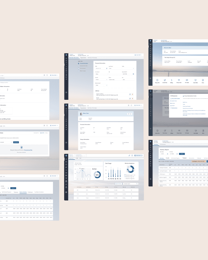
Legacy tools varied significantly in layout, hierarchy, and behavior, creating a fragmented user experience. Many relied on placeholders and tooltips to communicate key input guidance, which broke accessibility standards and caused issues for screen readers. Layouts lacked shared spacing rules, content zones, and interaction patterns, making each rebrand effort slow, manual, and difficult to scale during the React migration.
Problem
Legacy tools varied significantly in layout, hierarchy, and behavior, creating a fragmented user experience. Many relied on placeholders and tooltips to communicate key input guidance, which broke accessibility standards and caused issues for screen readers. Layouts lacked shared spacing rules, content zones, and interaction patterns, making each rebrand effort slow, manual, and difficult to scale during the React migration.

Outcome
The framework brought unity and accessibility to a wide range of input-based tools, replacing fragmented layouts with a consistent structure teams could trust. It improved the overall user experience, simplified future updates, and gave designers and developers a dependable foundation for building new React-based tools with clarity and confidence.
Faster rebrand and migration
+52%
Accessibility passing
+94%
Unified tools under one framemwork
30+

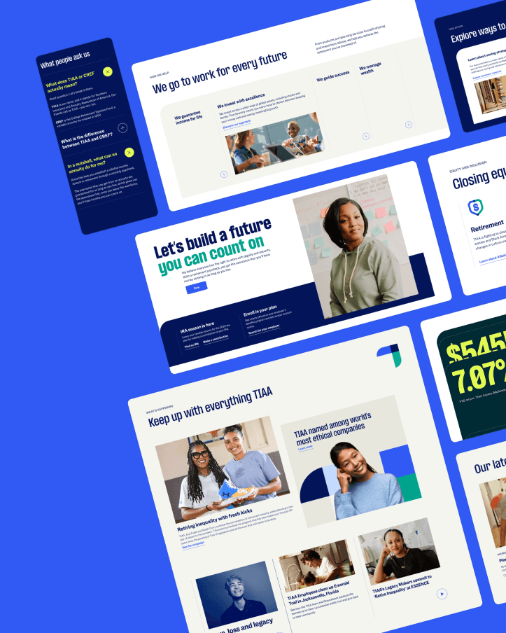
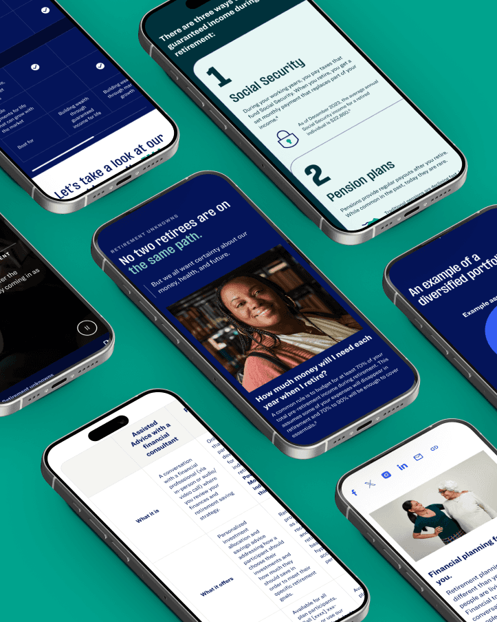
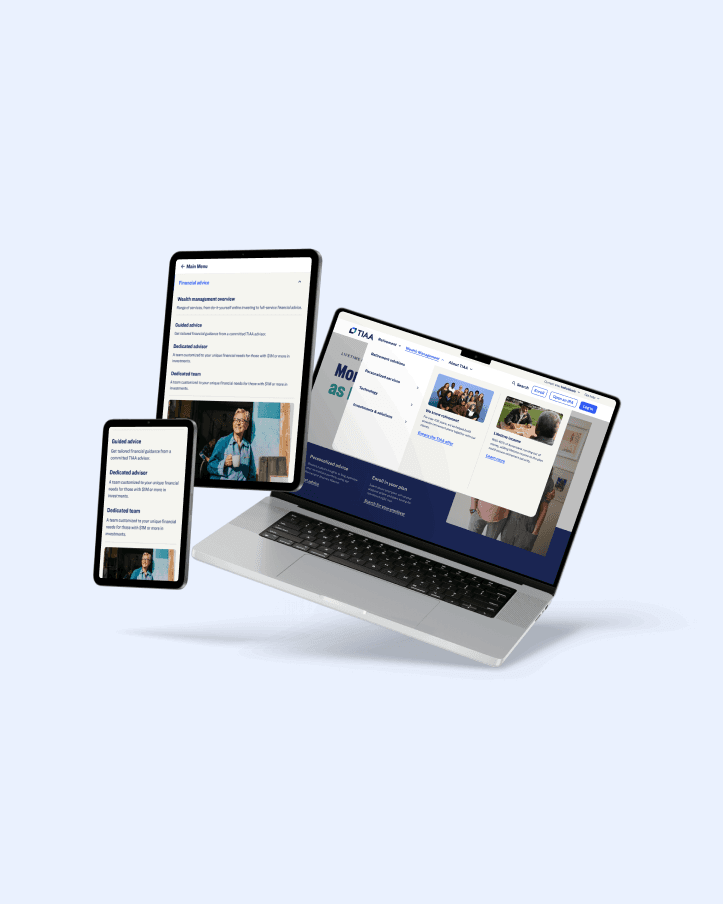
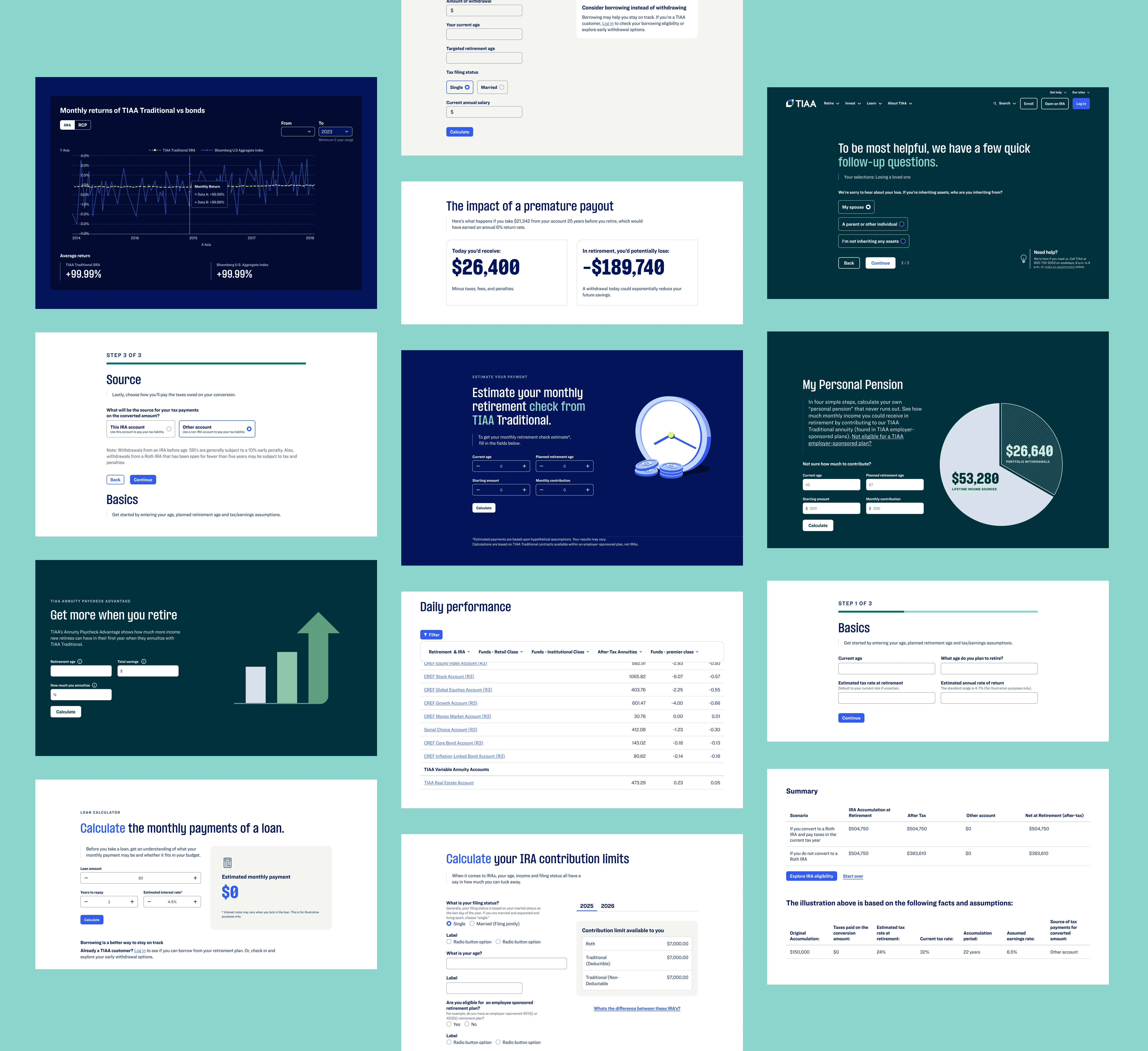
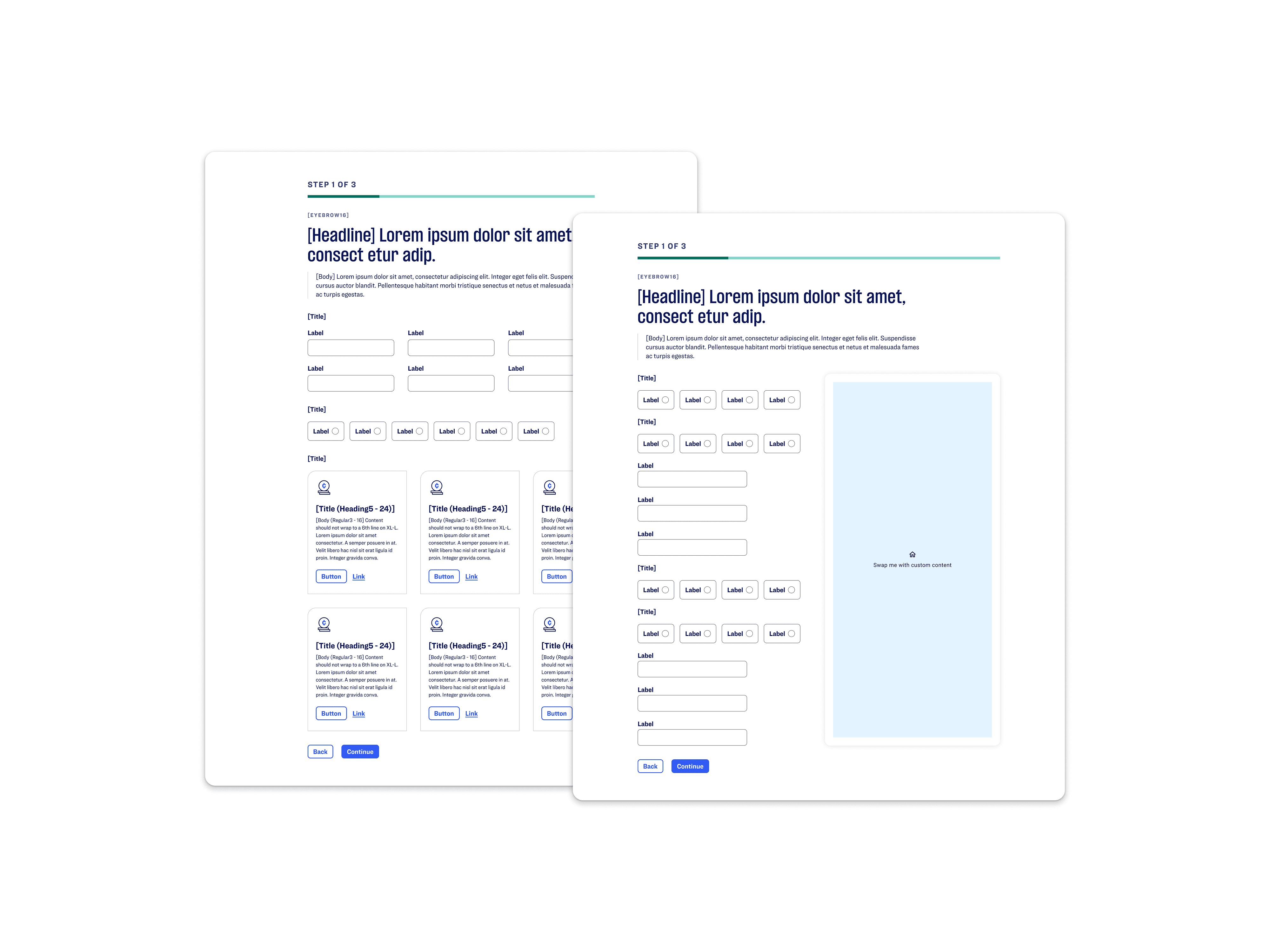
What we built
I designed a modular, three-column responsive framework with defined content zones, unified spacing, and token-aligned components for headings, inputs, steppers, and data visualization. Working with our Behavioral Experience Designer and the Ethos atomic team, we replaced placeholder-based inputs with persistent labels and contextual help patterns that met WCAG 2.1 AA standards. The system was implemented as a reusable AEM experience fragment, allowing React teams to adopt it quickly and consistently across tool types.

What I learned
I learned that solving accessibility issues often requires restructuring patterns, not just patching them. A unified layout accelerates delivery and reduces cognitive load across teams. Collaboration with behavioral and atomic partners is essential when designing flexible systems that need to scale across both legacy and modern tech stacks.
Other Cases
Other Cases
Other Cases