Lifetime Income
TIAA needed a clearer, more intuitive way to guide people through complex lifetime income topics. Our team shaped the experience into a unified storytelling system, and I led the pattern refinement, structure, and tokenization that allowed it to scale across TIAA.com.
Client:
TIAA
Industry:
Finance
Focus:
Patterns, Documentation, Tokens
Context:
2023 – 2024
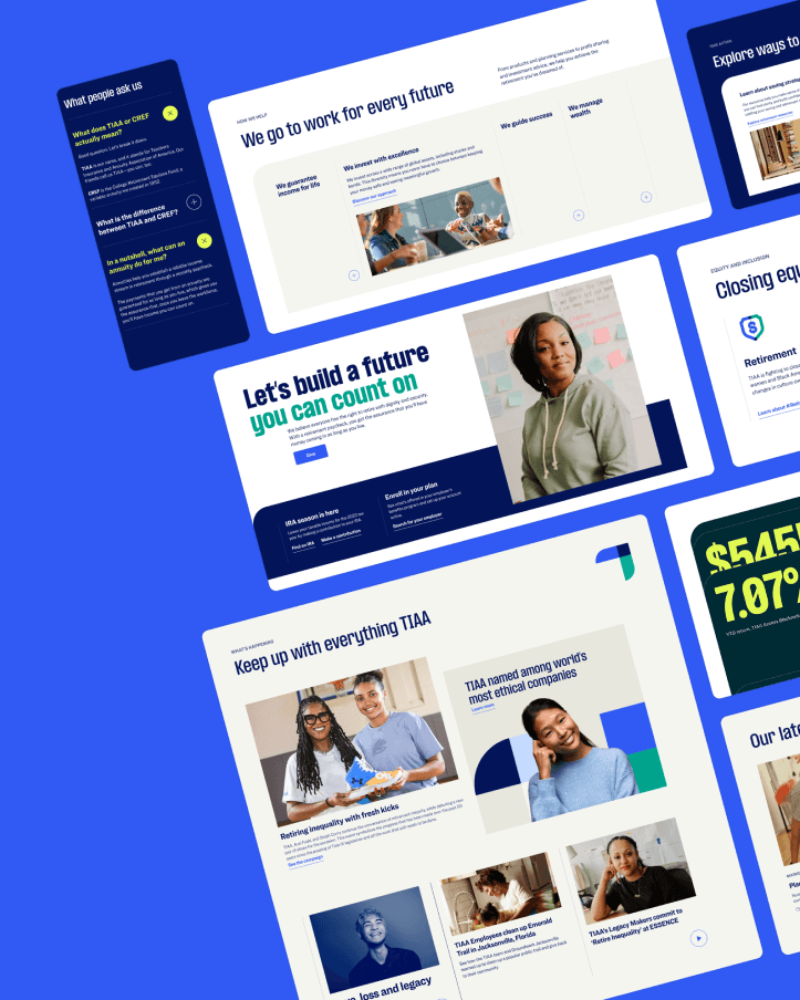
Problem
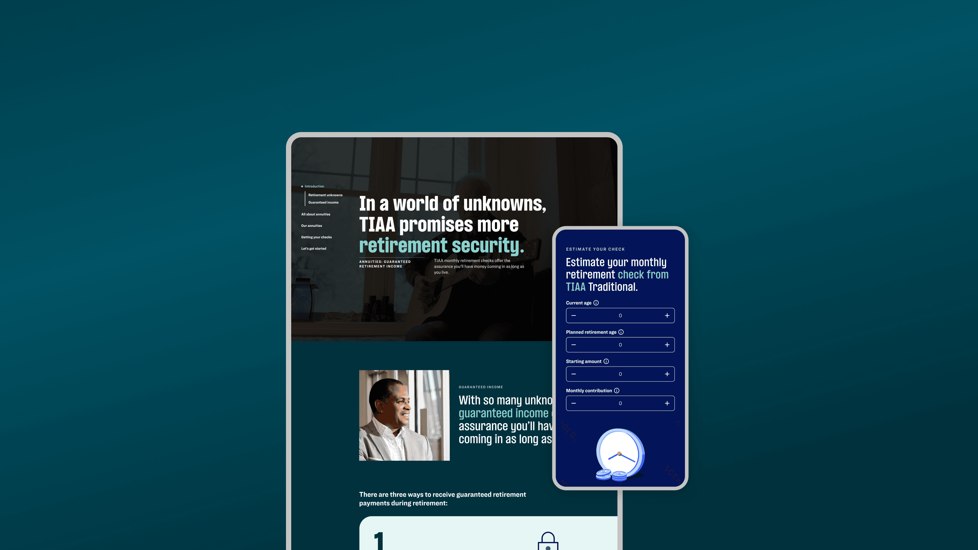
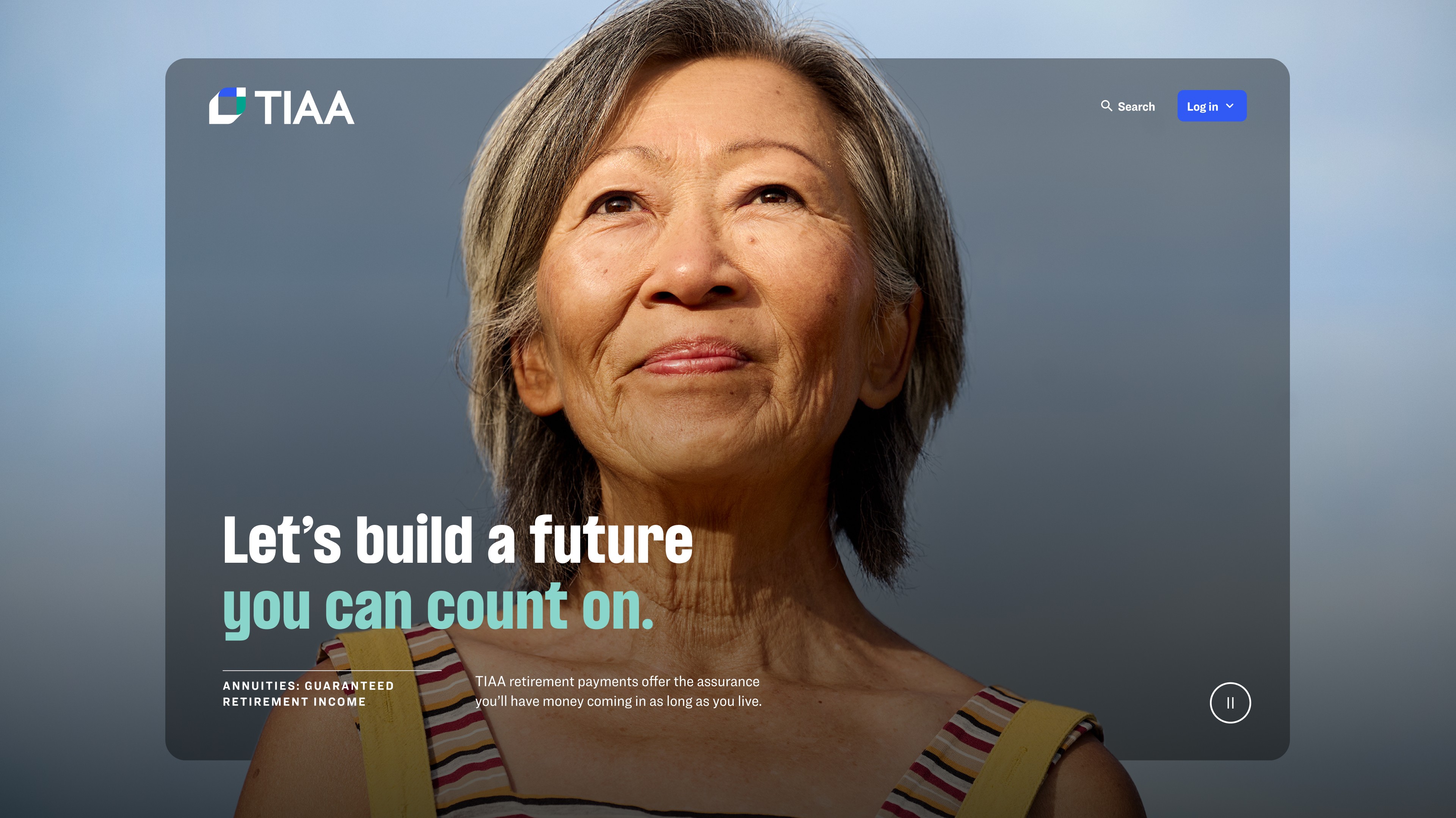
The original experience lived across multiple disconnected pages and wasn’t built for long-form financial content. The chapter navigation lacked structure, key interactions failed accessibility checks, the marquee video broke at ultra-wide breakpoints, and progressive cards collapsed unpredictably due to screen-height issues. Without a cohesive system, users struggled to stay oriented or understand how the story fit together.
Problem
The original experience lived across multiple disconnected pages and wasn’t built for long-form financial content. The chapter navigation lacked structure, key interactions failed accessibility checks, the marquee video broke at ultra-wide breakpoints, and progressive cards collapsed unpredictably due to screen-height issues. Without a cohesive system, users struggled to stay oriented or understand how the story fit together.
Outcome
The refined system made the experience clearer, more accessible, and easier to explore — allowing users to move through complex topics as one cohesive story instead of scattered pages.
Lift in advice session starts
+94%
Increased engagement
+40%
Fewer pages
-50%
Outcome
The refined system made the experience clearer, more accessible, and easier to explore — allowing users to move through complex topics as one cohesive story instead of scattered pages.
Lift in advice session starts
+94%
Increased engagement
+40%
Fewer pages
-50%
Outcome
The refined system made the experience clearer, more accessible, and easier to explore — allowing users to move through complex topics as one cohesive story instead of scattered pages.
Lift in advice session starts
+94%
Increased engagement
+40%
Fewer pages
-50%


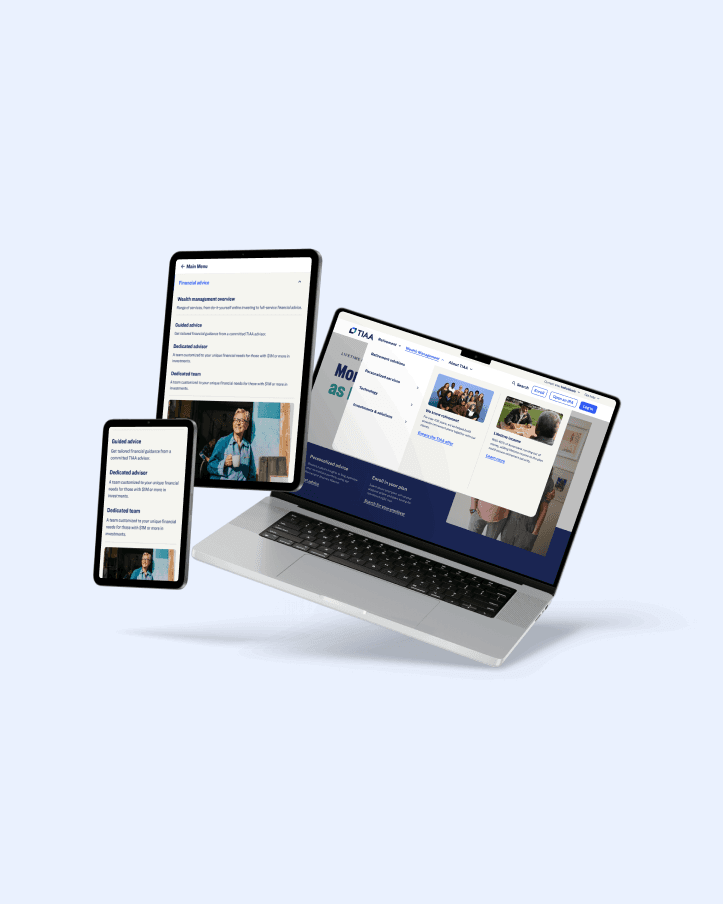
What we built
We created a consistent storytelling toolkit — a left-aligned chapter navigation system, accessible collapsible cards, a marquee video moment, and progressive cards that collapsed cleanly into one another. Each interaction was refined for clarity, accessibility, and responsive behavior, giving the long-form experience a structured, guided flow.
What I learned
This project showed me how directly accessibility drives design quality. Fixing issues like progressive card behavior, chapter-nav contrast, and the ultra-wide video moment didn’t just improve compliance — it made the entire experience stronger and more consistent. The five-hour troubleshooting session where we finally solved the video bug was the moment it all clicked: systems thinking, craft, and collaboration are what make complex journeys work.
Other Cases
Other Cases
Other Cases