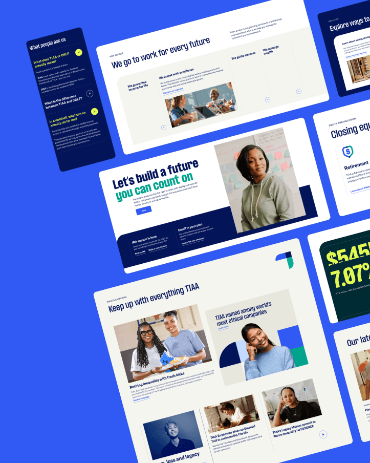
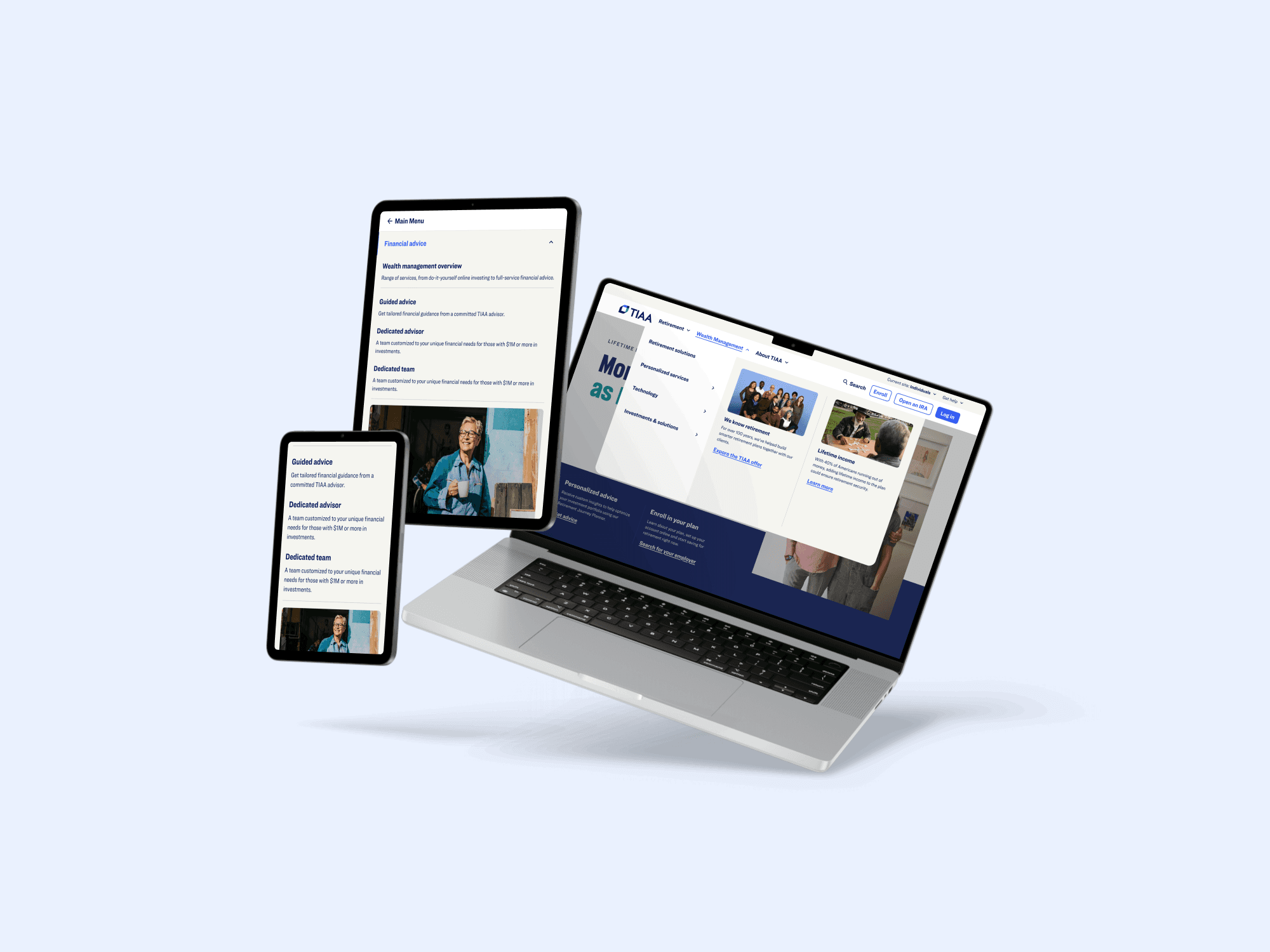
Megamenu Redesign
I designed a scalable megamenu for TIAA that organized hundreds of links into clear, accessible layouts—making navigation simpler for users and teams alike.
Client:
TIAA
Industry:
Finance
Focus:
Pattern, Documentation, Strategy
Context:
2025, Federated design
Problem
TIAA’s navigation needed to scale across multiple business lines and audiences but was overloaded, inconsistent, and difficult to manage. Working with a Behavioral Experience Designer, an Ethos system designer, and multiple development teams, I led the creation of a modular megamenu framework that brought structure, accessibility, and long-term scalability to TIAA’s digital ecosystem.

Outcome
Beta testing showed strong results: content updates were 60% faster, page discoverability improved by 45%, and accessibility compliance reached 100%. The new Megamenu unified navigation across TIAA’s platforms, organizing hundreds of links into clear structures and enabling teams to manage updates with minimal developer support.
Faster content updates
60%
Boost in page discoverability
45%
Accessibility compliance
100%


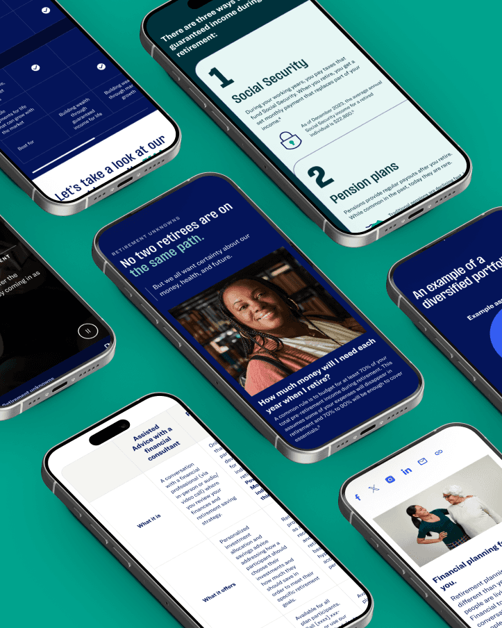
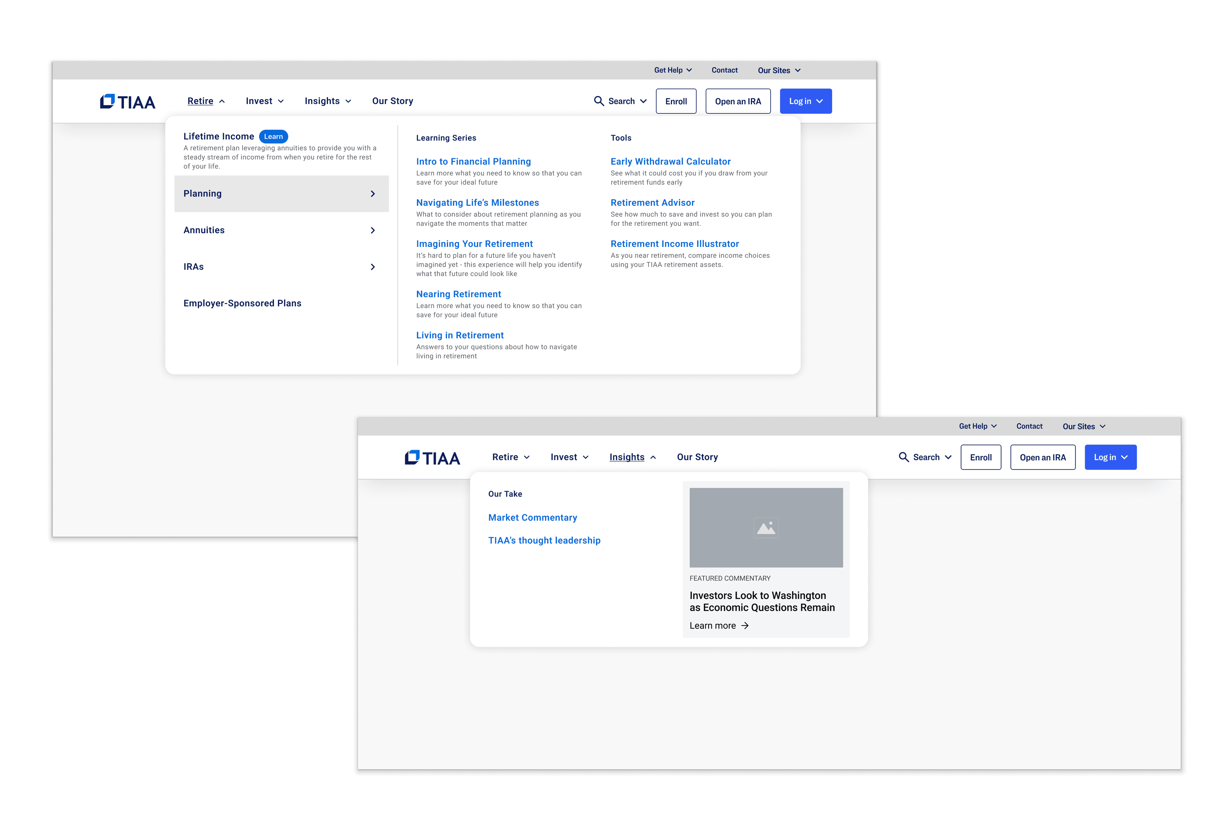
What we built
Working closely with a Behavioral Experience Designer, an Ethos system designer, and multiple development teams, we created a modular, federated navigation framework. The system introduced a multi-column layout that organized content by user intent and business priority. It supported different layout configurations so each audience—consumer, institutional, and participant—could see navigation tailored to their needs. Responsive behavior was defined across all major breakpoints, and accessibility standards were built in from the start. Comprehensive Figma documentation provided variants, behaviors, and developer specs to ensure consistency across teams and future scalability.


What I learned
This project reinforced how critical navigation is as an enterprise system, not just a UI pattern. I learned the value of designing frameworks that support both user behavior and organizational needs—especially when multiple teams contribute content. Close collaboration with behavioral design and system partners proved essential in balancing clarity, flexibility, and governance. Most importantly, I saw how impactful a well-structured system can be in reducing friction for users while empowering teams to move faster with confidence.
Other Cases
Other Cases
Other Cases