Lifetime income
Client
TIAA
Scope
UX/UI Design, System Design
Contributers
3 senior product designers, 1 director
Duration
2023-2024
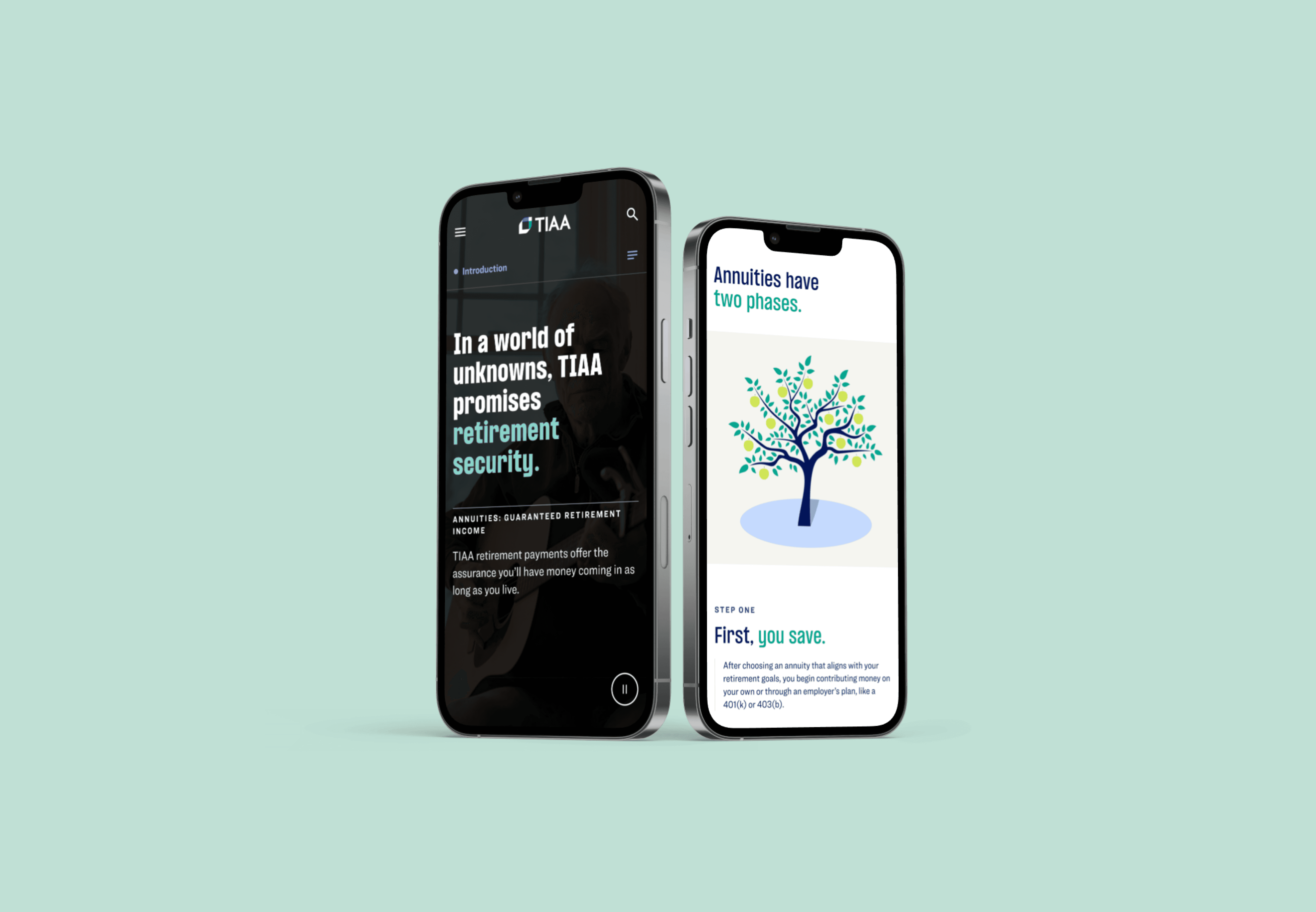
Building a Storytelling System for TIAA
Lifetime income is genuinely hard to explain. It's emotional, complicated, and the kind of topic that loses people the second you ask too much of them.
The existing experience scattered content across 50+ pages and trusted users to connect the dots. They didn't. Engagement was poor, comprehension was low, and accessibility failures were blocking launch entirely.
We rebuilt it as a single continuous story, one that could flex for very different readers without becoming three different products.
Outcomes
0+
0+
Growth in advice session starts after consolidating the Lifetime Income experience
0%
0%
Increase in enrollment starts driven by the redesigned narrative flow
-0%
-0%
Reduction in bounce rate across the Lifetime Income page
0%
0%
Increase in content engagement after moving from 50+ pages to one continuous experience


Defining the problem
TIAA's lifetime income content serves three very different audiences. Participants, the people actually planning their retirement, needed clear guidance they could trust without a finance background. Plan sponsors needed structured content they could scan quickly to support decisions for their employees. Consultants needed precision and consistency, since they were referencing this material while advising clients on complex decisions.
Three audiences, three different relationships to the same information. Spread across 50+ disconnected pages, none of them were getting what they needed.
One flow, three readers
We consolidated everything into a single scrollable flow with chapter navigation. The core decision was a modal: users could skim the main page, find something worth going deeper on, open it, read as much as they wanted, close it, and land right back where they were.
Participants got a story they could follow at their own pace, without feeling like homework. Plan sponsors could scan the surface for what they needed and move on. Consultants could go as deep as the topic demanded without losing their place in the broader narrative.
Same experience, three different ways through it. It sounds obvious in hindsight. It wasn't obvious in practice.

Fixing it for real
As we moved toward production, the real work started showing itself. Focus order issues. Contrast failures. Animation that felt broken rather than intentional. I went through these pattern by pattern rather than patching page by page, rethinking component heights, simplifying interactions, and documenting responsive rules that engineering could actually build from.
Treating accessibility as a design input instead of an audit at the end made the whole thing better. Layouts got cleaner. Interactions got more predictable. Content got easier to consume for all three groups, not just the ones accessibility checks are usually written for.
A Repeatable Framework
Lifetime Income was never meant to be a one-off. That was the point.
Overlapping patterns got consolidated. New ones were added only where the system genuinely needed them, each documented with variants, tokens, and responsive rules before going anywhere near engineering. Implementation friction dropped. Engineers stopped needing clarification. Designers built with confidence.
We built it for lifetime income. It was always going to be bigger than that.

A framework designed to scale
The numbers made the case.
Advice session starts grew 94%. Enrollment starts increased 80%. Bounce rate dropped 41%. Content engagement went up 40%. Four industry awards.
For a topic as emotionally loaded and genuinely complicated as retirement income, getting people to stay, read, and take action is not a small thing.
The right UX decision, built on a system that actually holds, has a way of doing that.


Lifetime income
Lifetime income
Client
TIAA
My role
UX/UI Design, System Design
Contributers
3 senior product designers, 1 director
Duration
2023-2024
Building a Storytelling System for TIAA
Lifetime income is genuinely hard to explain. It's emotional, complicated, and the kind of topic that loses people the second you ask too much of them.
The existing experience scattered content across 50+ pages and trusted users to connect the dots. They didn't. Engagement was poor, comprehension was low, and accessibility failures were blocking launch entirely.
We rebuilt it as a single continuous story, one that could flex for very different readers without becoming three different products.
Defining the problem
TIAA's lifetime income content serves three very different audiences. Participants, the people actually planning their retirement, needed clear guidance they could trust without a finance background. Plan sponsors needed structured content they could scan quickly to support decisions for their employees. Consultants needed precision and consistency, since they were referencing this material while advising clients on complex decisions.
Three audiences, three different relationships to the same information. Spread across 50+ disconnected pages, none of them were getting what they needed.
One flow, three readers
We consolidated everything into a single scrollable flow with chapter navigation. The core decision was a modal: users could skim the main page, find something worth going deeper on, open it, read as much as they wanted, close it, and land right back where they were.
Participants got a story they could follow at their own pace, without feeling like homework. Plan sponsors could scan the surface for what they needed and move on. Consultants could go as deep as the topic demanded without losing their place in the broader narrative.
Same experience, three different ways through it. It sounds obvious in hindsight. It wasn't obvious in practice.
Fixing it for real
As we moved toward production, the real work started showing itself. Focus order issues. Contrast failures. Animation that felt broken rather than intentional. I went through these pattern by pattern rather than patching page by page, rethinking component heights, simplifying interactions, and documenting responsive rules that engineering could actually build from.
Treating accessibility as a design input instead of an audit at the end made the whole thing better. Layouts got cleaner. Interactions got more predictable. Content got easier to consume for all three groups, not just the ones accessibility checks are usually written for.
Outcomes
0+
0+
Growth in advice session starts after consolidating the Lifetime Income experience
0+
0+
Growth in advice session starts after consolidating the Lifetime Income experience
0%
0%
Increase in enrollment starts driven by the redesigned narrative flow
0%
0%
Increase in enrollment starts driven by the redesigned narrative flow
-0%
-0%
Reduction in bounce rate across the Lifetime Income page
-0%
-0%
Reduction in bounce rate across the Lifetime Income page
0%
0%
Increase in content engagement after moving from 50+ pages to one continuous experience
0%
0%
Increase in content engagement after moving from 50+ pages to one continuous experience