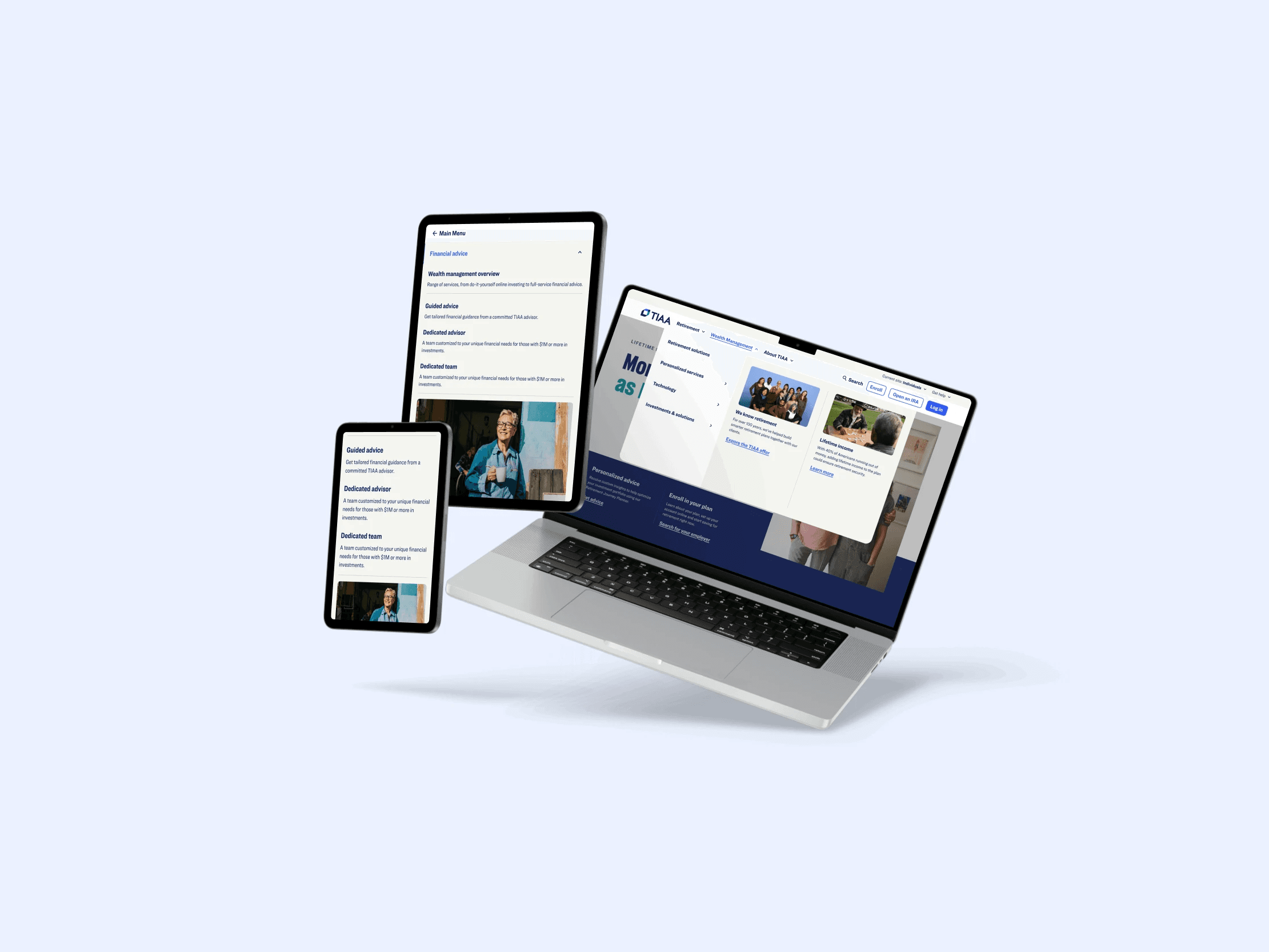
The modular Megamenu reduced cognitive load by separating orientation from exploration. Fixed top-level navigation anchored users, while flexible content modules helped surface relevant pages faster. Users were more likely to find what they needed without backtracking or abandoning sessions.
The results told the story: a 41% reduction in bounce rate through clearer content discovery. Standardized navigation patterns improved crawlability and internal linking across TIAA.org, contributing to a 76% improvement in SEO performance. By replacing bespoke dropdowns with system-backed structures, content relationships became clearer to both users and search engines.


The Megamenu shifted from a UI pattern to shared infrastructure. New content hubs, calculators, and long-form experiences could launch without rethinking navigation, allowing information architecture to evolve without disrupting users.
Teams shipped new pages and sections using pre-approved modules instead of custom navigation builds, reducing design and development overhead while maintaining accessibility and brand consistency.


Design, engineering, and content moved from opinion-driven navigation decisions to shared rules. The Megamenu created a common language for how navigation works, making decisions faster, governance clearer, and execution more consistent over time.
The real win wasn't just better navigation—it was organizational alignment. A component that once created friction now enables velocity.


