Defining the problem
Agents needed to move fast on a call without losing their place, and clear guidance during first-time enrollments when they're explaining basics to new buyers. Brokers were juggling Florida Blue alongside other carriers' systems, often managing the same client for years, and couldn't afford a tool that cost them more time than the alternatives.
Both groups shared the same core fear: editing time-sensitive health records was risky. One wrong edit could misrepresent a member's coverage history, and they knew it.
What they needed was simple to say and hard to build: let me do the task in front of me without fear of breaking something else.


How we modernized it
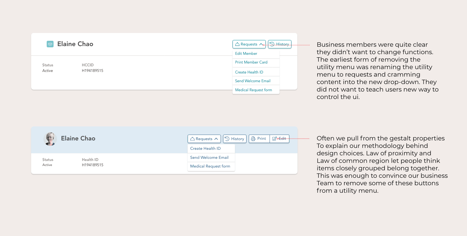
We replaced the node-based menus with contextual actions embedded directly in the enrollment screens. Controls lived where the action happened, not three clicks away. This is what let agents stay on a call without losing their place, and gave brokers fast access to plan history without digging through menus for clients they'd worked with for years.
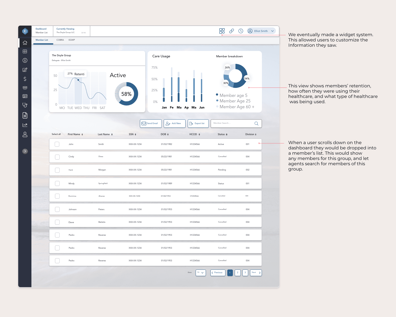
We also reorganized the layout around high-value work, pulling the information both groups needed most to the front and pushing the rest back. Less time spent navigating meant less friction switching between tasks across a high volume of clients.
None of this touched the backend. The constraint was real, so the redesign had to work within it instead of around it.
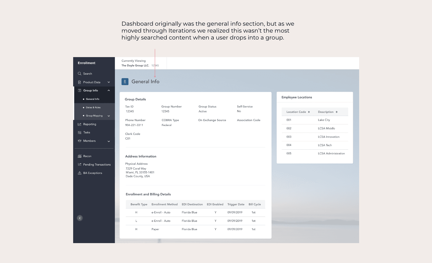
The original layout prioritized general information over action, forcing agents to scan dense screens and jump between sections. We re-evaluated how space was used and shifted the interface toward power users. Sections were reorganized, low-value content was deprioritized, and high-impact information was pulled forward. By aligning layout with what agents actually needed, the interface became easier to scan and less error-prone.

Updating time-sensitive health data was one of the most fragile parts of EnrollPoint. Agents needed to re-date member activity without breaking records or losing context. We redesigned the time-stamping experience around a clear, chronological model that grouped plans, classifications, and statuses by date. This allowed agents to understand history at a glance and make changes with confidence, removing the need for risky workarounds.
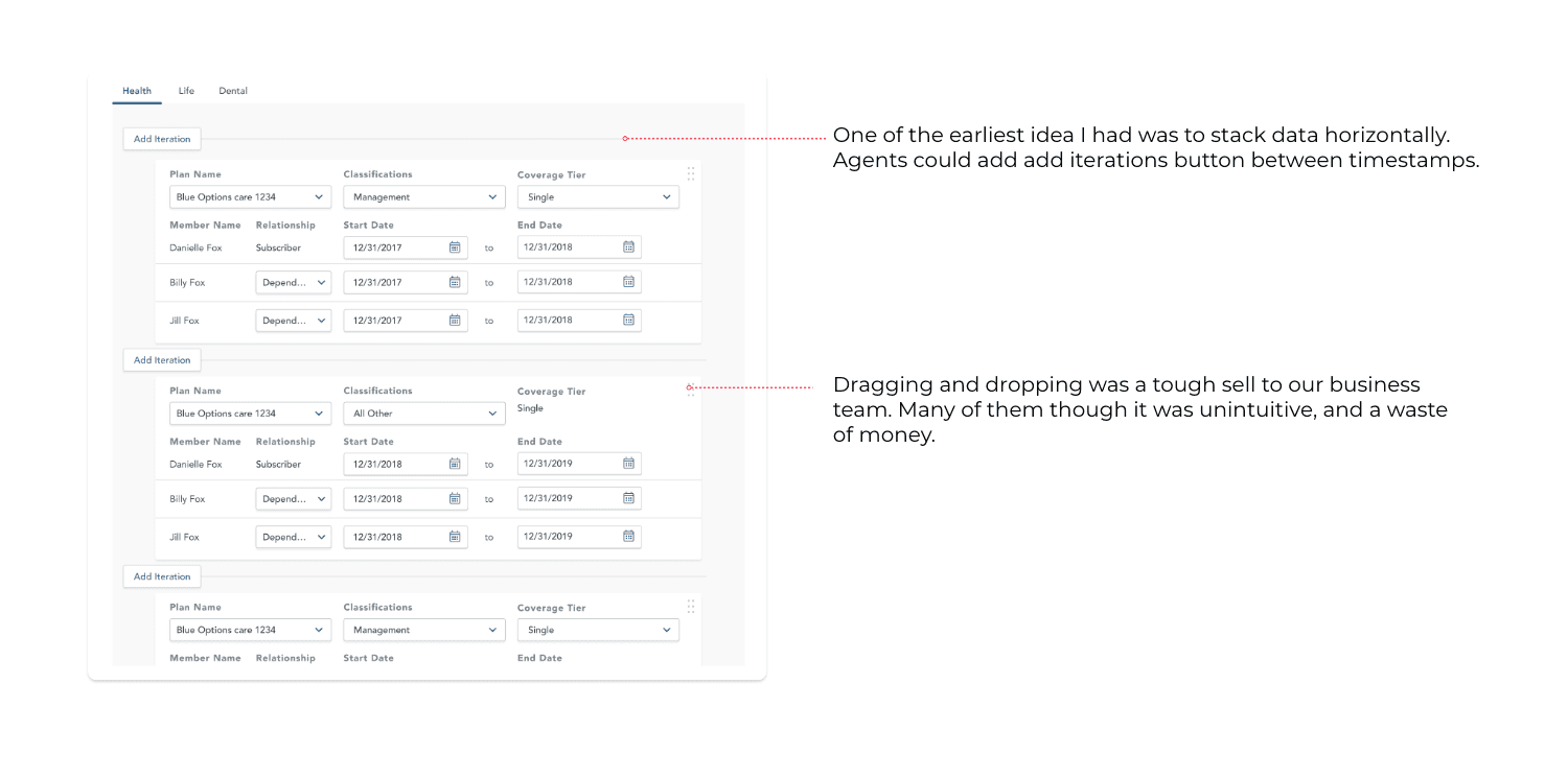
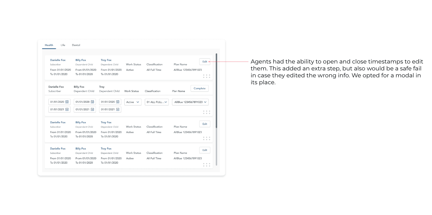
Solving time-stamping required heavy iteration. Early concepts explored horizontal timelines and flexible interactions, but many introduced risk during complex edits. Business partners were especially concerned about accidental changes, forcing us to balance flexibility with safety. We prioritized clarity and control over clever interactions—anchoring edits to a chronological structure and using deliberate interaction states reduced hesitation and rebuilt trust in one of the system's most fragile areas.


What shipped