
TIAA
System design
Building a Storytelling System for TIAA

Overview
My role
System design lead
Team
3 senior product designers, 1 director
Duration
4 months 2024
Goals
The goal of this work was to create a storytelling framework that helps people understand lifetime income in one clear flow, while establishing a system TIAA could reuse for future long-form stories.
Create a unified story
Bring fragmented lifetime income content into a single narrative users could follow from start to finish.
Ensure accessibility and performance
Design an experience that works reliably across screen sizes, assistive technologies, and real-world constraints.
Enable scale through systems
Build reusable patterns and rules that allow teams to create future flow-story pages without reinventing structure or behavior.
Original design


Initial findings
Reviewing the early designs surfaced several structural issues that prevented the experience from scaling.
Fragmented flow
Content still relied on multiple pages and entry points, making it difficult for users to stay oriented or understand how concepts connected.
Patterns not built for production
Several interactions overlapped in purpose or broke across breakpoints. Similar patterns were being designed multiple times, increasing design and development debt.
Accessibility and performance risks
Focus order, color contrast, component height, and long-scroll performance issues blocked launch and would have required ongoing patchwork fixes if left unresolved.
Unified storytelling flow
50% fewer pages, +94% advice session starts
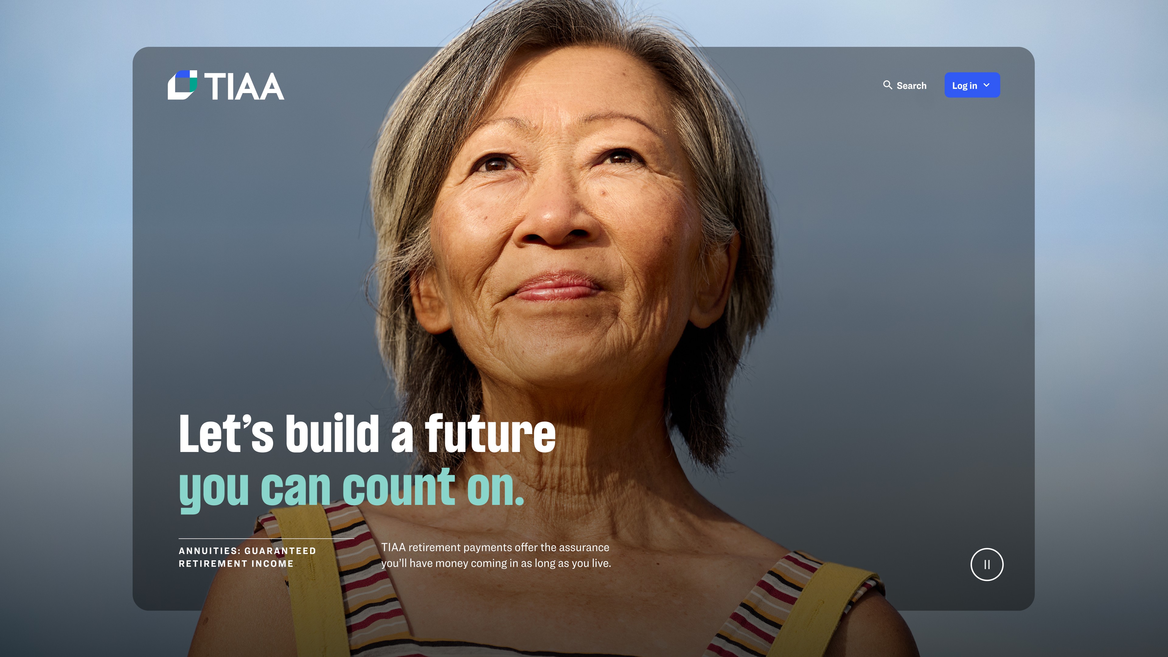
The original Lifetime Income experience was fragmented across multiple pages, forcing users to bounce between sections and piece together the story on their own. Orientation broke quickly, and understanding suffered.
We made a deliberate decision to treat lifetime income as one continuous narrative. Content was shortened and restructured, disclosures were intentionally placed, and the chapter navigation was refined to balance education, compliance, and performance.
The result was a shorter, clearer experience. Page count dropped by 50 percent, and advice session starts increased by 94 percent. Users stayed with the story long enough to understand it and act on it.


Helping users stay oriented
Lifetime income is inherently complex and emotional. The chapter navigation existed to keep users grounded in the story, helping them understand where they were and what was coming next without feeling overwhelmed.


From fragmented pages to one clear narrative
By consolidating the experience into a single flow, users could scan, pause, and dive deeper without losing context, turning passive reading into active understanding.

Accessibility and performance that held up at scale
Early versions of the experience surfaced accessibility and performance issues that blocked launch. Focus order failed across sections, color contrast issues reduced readability, and interactions degraded at larger screen sizes.
Instead of fixing issues page by page, we resolved them at the pattern level. Component heights were rethought, interactions simplified, hover behaviors removed on mobile, and responsive rules clearly defined across breakpoints.
By addressing accessibility and performance systemically, the experience stabilized. Teams could ship confidently without reintroducing risk, regressions, or one-off fixes.


Accessibility as a design driver
Treating accessibility as a constraint improved overall design quality. Layouts became clearer, interactions more predictable, and content easier to consume across devices.


Built to perform in the real world
Performance issues uncovered during development informed how long-form content should behave, shaping standards that extended beyond Lifetime Income.


A framework designed to scale
Lifetime Income was not designed as a one-off page. It was built as the first proof point of a broader storytelling framework.
Overlapping patterns were consolidated into a smaller, system-backed set. New patterns were introduced only where the system required them, with clear variants, tokens, and responsive rules.
As documentation matured, implementation friction dropped. Engineers stopped needing clarification, designers built with confidence, and governance became enforceable without slowing teams down.


Reducing design and delivery debt
Consolidating patterns reduced ambiguity and made the system easier to maintain, test, and extend.


Establishing a repeatable model
The storytelling system created here became a foundation teams could reuse to explain other complex financial topics without starting from scratch.
