Verizon
Web Design & Strategy
Redefining a Scalable Subscription Ecosystem

Overview
My role
Visual design, System design, UX
Team
2 Senior product designers, 3 junior product designers, 2 UX designers
Duration
3 months 2023
Goals
The goal of this work was to define a scalable foundation for a subscription platform designed to support a growing ecosystem of digital services. As Verizon expanded its offerings across streaming, gaming, and lifestyle subscriptions, the platform needed a clear product model that could support bundling, discovery, and long-term management without adding complexity.
Scalable subscription platform
+play supported dozens of services, each with different plans, activation rules, and partner requirements. Early experiences were fragmented and difficult to extend. The work needed to establish shared patterns and frameworks that could scale across current and future providers without relying on bespoke solutions.
Reduce friction
Enrollment, migration, and activation flows varied widely between services and created unnecessary drop-off. A key goal was to shorten subscription flows, reduce cognitive load, and make activation more predictable so users could move through the experience with confidence.
Multi-service ecosystem strategy
The platform needed to support bundling, cross-service discovery, and upsell opportunities while maintaining clarity and trust. This required designing a system that balanced flexibility with consistency and created a foundation for ongoing growth across Verizon’s subscription ecosystem.
Original design


Initial findings
As the platform evolved, several core issues consistently surfaced.
Long checkout flows Enrolling in a service required users to move through multiple screens each time. Separating plan selection, payment, and confirmation slowed momentum and increased drop-off.
Repetitive enrollment Returning users were often treated like first-time customers. Payment and account details had to be re-entered when adding new services, making multi-service enrollment feel heavy.
Slow subscription changes Updating a subscription, such as upgrading, downgrading, or managing bundles, required navigating multiple screens and confirmations. Simple changes took longer than expected.
Disconnected product surfaces Shop and Discover looked and behaved like separate products. Differences in layout, hierarchy, and interaction patterns made the experience feel fragmented and harder to understand as a unified platform.
Unclear activation state Users were not always sure when a subscription was fully active. Handoffs to partner experiences created uncertainty at the end of the flow

Reducing friction across enrollment and management
53–70% tile height reduction
The original home page relied on large, expressive tiles that limited how much content users could see at once. On mobile, tiles were roughly 220px tall, and on desktop they reached up to 474px, forcing users to scroll before they could meaningfully scan the platform.
We redesigned the tile system to be significantly more compact. Mobile tiles were reduced by 53 percent, and desktop tiles by over 70 percent, dramatically shortening the page and increasing content density.
As a result, pages became noticeably shorter, with 8–12 additional tiles visible above the fold, making it easier for users to understand the breadth of the platform at a glance.
Faster scanning through clearer hierarchy
Shorter tiles improved scanability and reduced visual noise across the page. Introducing dark mode reinforced hierarchy by pushing backgrounds back and allowing content to come forward, helping users move into Shop or Discover more quickly.


Solving for scale
To support a growing ecosystem of services, the platform needed to move beyond one-off designs and toward a shared product model. Each new provider introduced unique plans, activation rules, and constraints, which made bespoke solutions increasingly expensive and fragile.
We shifted the work from designing individual pages to designing a system that could absorb variation without breaking. Shared layout rules, component structures, and interaction patterns were established so new services could be introduced without rethinking the experience each time.


Designed to extend
Scalability was treated as a first-class requirement, not an afterthought. Patterns were designed to accommodate future bundles, new service categories, and evolving partner needs without adding visual or cognitive complexity.
This foundation made it possible to grow the ecosystem while keeping the experience predictable, understandable, and cohesive for users.

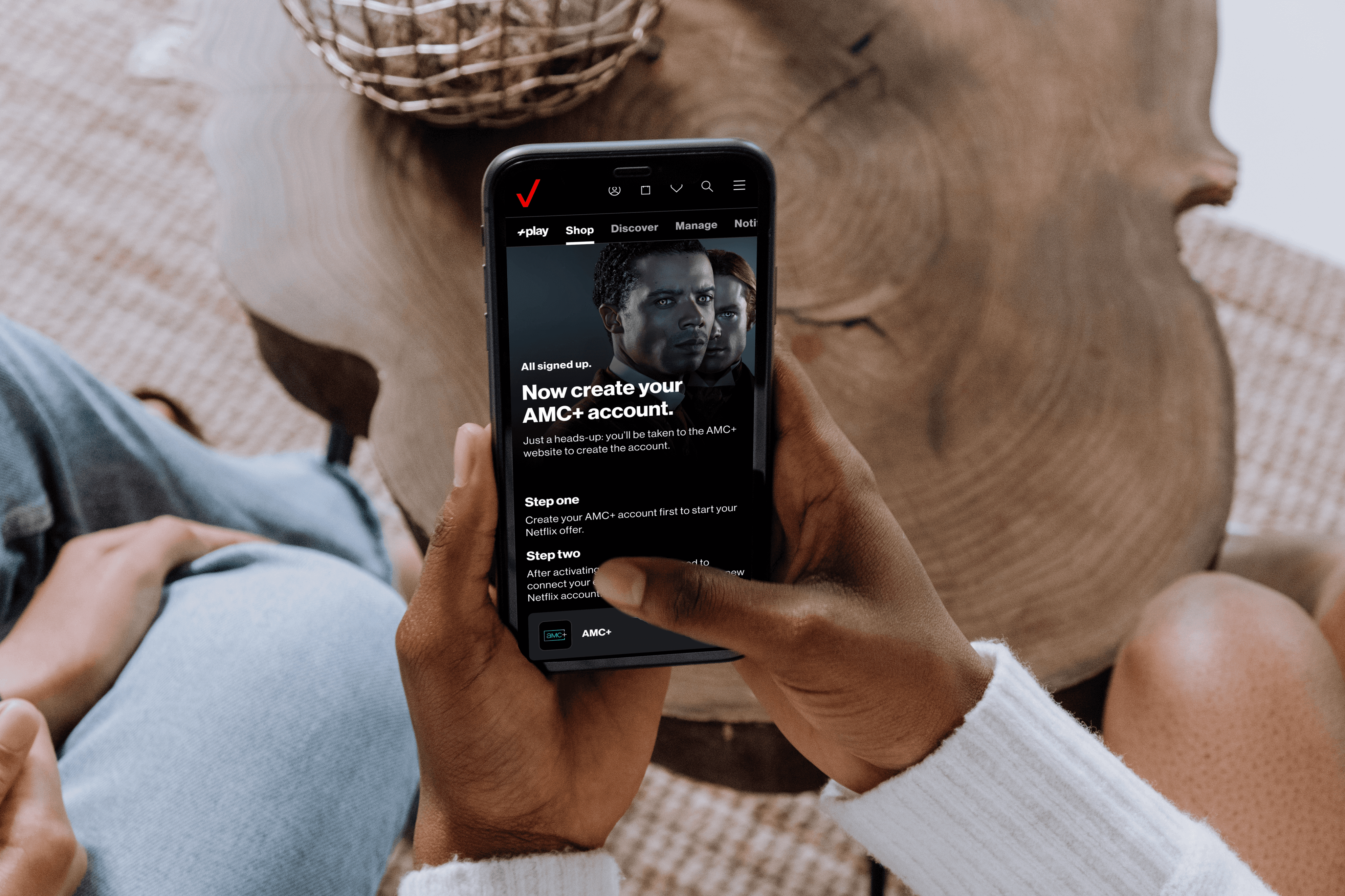
Shorter subscription flows
32% faster enrollment
Enrollment originally required users to move through multiple screens, often repeating the same steps when adding or changing services. This slowed momentum and increased friction.
We unified enrollment into a single flow that reused account and payment context, allowing users to move from selection to confirmation with fewer interruptions. Subscription flows became 32 percent faster as a result.
28% fewer migration steps
Managing existing subscriptions introduced similar friction. Actions like upgrading or bundling required unnecessary steps and confirmations.
By aligning enrollment and management under a shared interaction model, migration flows were simplified, reducing steps by 28 percent and making changes feel immediate.


Streamlined subscription management
Managing subscriptions was originally slow and fragmented. Simple actions like upgrading, downgrading, or adjusting bundles required navigating multiple screens and confirmations, making ongoing management feel heavier than necessary.
We simplified subscription management by aligning it with the same interaction model used in enrollment. Changes could be made in fewer steps, with clearer feedback and immediate confirmation, making ownership feel faster and more predictable.


Designed to evolve
The platform was designed with growth in mind. New services, bundles, and content types were expected to evolve over time, and the system needed to accommodate that change without increasing complexity for users or teams.
By establishing shared patterns, flexible layouts, and clear interaction models, the platform can support future providers, deeper personalization, and new subscription offerings without reworking the core experience. This foundation allows the product to grow while remaining familiar, predictable, and easy to use.