Tool Templates

Client
TIAA
Scope
UX Strategy, System Design
Contributers
Miraj Mehta - Behavior design
Duration
Oct 2025-Jan 2026
Retirement Calculators & Financial Tools
TIAA had 30 financial tools scattered across its platform. Debt calculators. Retirement planners. IRA contribution tools. Tax estimators. Each one built separately, styled differently, and maintained independently. The rebrand had already touched 800 pages. These tools were next.
The problem was not just visual. Rebuilding 30 end-to-end flows one at a time would create enormous dev debt and take years. We needed a smarter approach.

Starting with data visualization
I partnered with a behavioral scientist to audit the full landscape before touching a single screen. We started with charts. Financial tools live and die by how well they visualize data, so before anything else we identified the most commonly used chart types across the suite and built them out across three brand palettes. Line charts, bar charts, area charts, each one pressure tested across themes before we moved on.
That foundation informed everything that followed.


Finding the underlying pattern
Once the data visualization layer was solid we mapped the use cases across all 30 tools and looked for what they had in common.
What we found was that despite appearing completely different on the surface, most tools were doing a small number of things. Asking questions. Processing inputs. Visualizing data. Surfacing a result. The variety was in the content, not the interaction model.
But that did not mean the tools were interchangeable. A debt payoff calculator needed to handle multiple debt types with different interest rates without overwhelming users mid-flow. A retirement planner had to guide users through complex projections without losing them in the data. An IRA contribution tool needed to surface eligibility rules without feeling like a compliance form. Each tool had its own user in a specific emotional state making a specific kind of financial decision.
The framework had to be consistent enough to scale and flexible enough to respect those differences.
Building a framework, not thirty tools
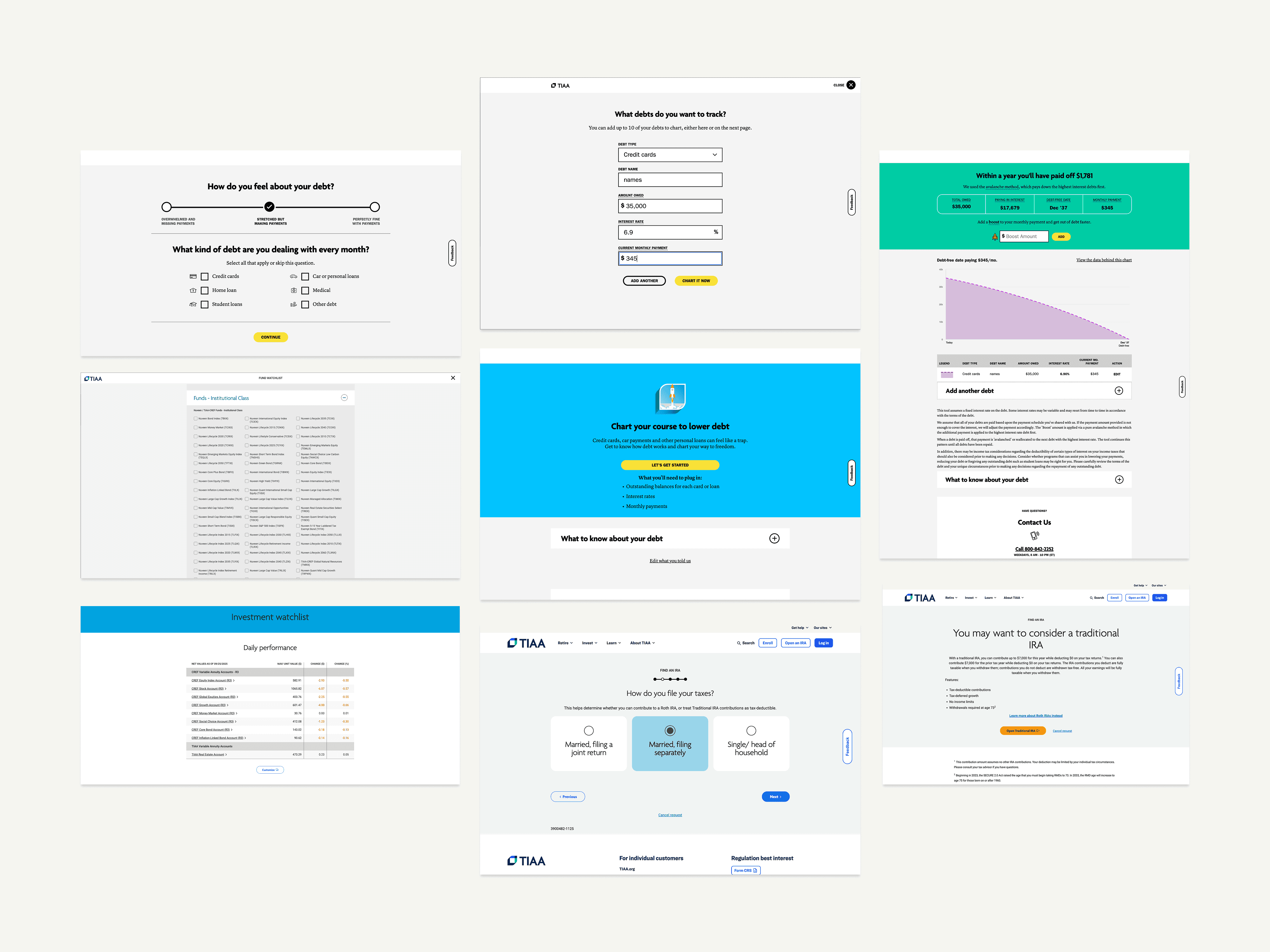
Instead of redesigning each tool individually I built a flexible template framework that could accommodate every use case across the suite.
A question builder that handled multiple input types, text fields, radio buttons, dropdowns, sliders, across any combination a tool required. A data visualization system with chart components that could flex across different data sets without requiring custom builds each time. A results template that surfaced outputs clearly regardless of what the tool was calculating.
The tools looked considered and purposeful. But underneath they were all running on the same framework.

Pressure testing with stakeholders
Each tool had its own stakeholder who knew their calculator deeply and had strong opinions about how it should work.
We used tools like Figma Make to rapidly prototype each experience and bring it directly to those stakeholders for review. This let us test directions without committing to them. Rather than designing in isolation and presenting finished work, we were showing progress early, gathering real feedback, and adjusting before anything went to engineering.
That iteration loop kept us moving fast without creating rework down the line.
Holding the line with engineering
Dev had a reasonable position. Thirty tools built on one framework should look and feel identical. It would be easier to build, easier to maintain, and easier to scale.
But identical was not the right answer for users. A debt payoff calculator and a retirement income planner are fundamentally different experiences. They attract different users in different emotional states making different kinds of decisions. Treating them the same would create confusion, not consistency.
I held that position through multiple rounds of pushback. The framework stayed consistent. The experiences were each approached with care for what that specific tool needed to do for its specific user.

What it unlocked
Thirty tools rebranded without thirty separate builds. A flexible framework that let teams swap data sets, adjust question flows, and extend to new tools without starting from scratch each time.
The behavioral science partnership meant the question structures were grounded in how people actually process financial decisions, not just how the data was organized internally.
0+
0+
Tools redesigned
0%
0%
reduction in dev time
0%
0%
faster page design.


Tool Templates
Tool Templates
Client
TIAA
My role
UX Strategy, System Design
Contributers
Miraj Mehta - Behavior design
Duration
Oct 2025-Jan 2026
Retirement Calculators & Financial Tools
TIAA had 30 financial tools scattered across its platform. Debt calculators. Retirement planners. IRA contribution tools. Tax estimators. Each one built separately, styled differently, and maintained independently. The rebrand had already touched 800 pages. These tools were next.
The problem was not just visual. Rebuilding 30 end-to-end flows one at a time would create enormous dev debt and take years. We needed a smarter approach.
Starting with data visualization
I partnered with a behavioral scientist to audit the full landscape before touching a single screen. We started with charts. Financial tools live and die by how well they visualize data, so before anything else we identified the most commonly used chart types across the suite and built them out across three brand palettes. Line charts, bar charts, area charts, each one pressure tested across themes before we moved on.
That foundation informed everything that followed.
“Jeremy brings a rare blend of creativity and system design knowledge. He's a key resource for any digital team looking to master the art of creating components for development, designers, and publishers. It's been a pleasure to work with him, and I'd hire him as the lynchpin of any dynamic creative team in the digital space.”

Dylan Rodrigues
Program Manager at TIAA
Finding the underlying pattern
Once the data visualization layer was solid we mapped the use cases across all 30 tools and looked for what they had in common.
What we found was that despite appearing completely different on the surface, most tools were doing a small number of things. Asking questions. Processing inputs. Visualizing data. Surfacing a result. The variety was in the content, not the interaction model.
But that did not mean the tools were interchangeable. A debt payoff calculator needed to handle multiple debt types with different interest rates without overwhelming users mid-flow. A retirement planner had to guide users through complex projections without losing them in the data. An IRA contribution tool needed to surface eligibility rules without feeling like a compliance form. Each tool had its own user in a specific emotional state making a specific kind of financial decision.
The framework had to be consistent enough to scale and flexible enough to respect those differences.
Building a framework, not thirty tools
Instead of redesigning each tool individually I built a flexible template framework that could accommodate every use case across the suite.
A question builder that handled multiple input types, text fields, radio buttons, dropdowns, sliders, across any combination a tool required. A data visualization system with chart components that could flex across different data sets without requiring custom builds each time. A results template that surfaced outputs clearly regardless of what the tool was calculating.
The tools looked considered and purposeful. But underneath they were all running on the same framework.
Pressure testing with stakeholders
Each tool had its own stakeholder who knew their calculator deeply and had strong opinions about how it should work.
We used tools like Figma Make to rapidly prototype each experience and bring it directly to those stakeholders for review. This let us test directions without committing to them. Rather than designing in isolation and presenting finished work, we were showing progress early, gathering real feedback, and adjusting before anything went to engineering.
That iteration loop kept us moving fast without creating rework down the line.
Holding the line with engineering
Dev had a reasonable position. Thirty tools built on one framework should look and feel identical. It would be easier to build, easier to maintain, and easier to scale.
But identical was not the right answer for users. A debt payoff calculator and a retirement income planner are fundamentally different experiences. They attract different users in different emotional states making different kinds of decisions. Treating them the same would create confusion, not consistency.
I held that position through multiple rounds of pushback. The framework stayed consistent. The experiences were each approached with care for what that specific tool needed to do for its specific user.
What it unlocked
Thirty tools rebranded without thirty separate builds. A flexible framework that let teams swap data sets, adjust question flows, and extend to new tools without starting from scratch each time.
The behavioral science partnership meant the question structures were grounded in how people actually process financial decisions, not just how the data was organized internally.
0+
0+
Tools redesigned
0%
0%
faster page design.